Nibble Online Market Tour Redesign
Reimagining a digital guide to treasured local food markets
In Somerville, Massachusetts, the Union Square neighborhood is home to several independent, immigrant-owned markets. The storied local businesses define the area’s character. In 2007, the City began offering guided tours of the markets. Their mission: to help promote cultural tourism and economic development in the area. For this project, I redesigned the self-guided, online version of the original market tour.
Client: Somerville Arts Council, City of Somerville
Timeline: September 2020 – June 2021
Roles: UX Research, Interactive Design, Content Strategy, Visual Design, Project Coordination
Tools: Sketch, InVision, Maze, Hemingway, Miro, Google JamBoards, Google Lighthouse, Web Disability Simulator
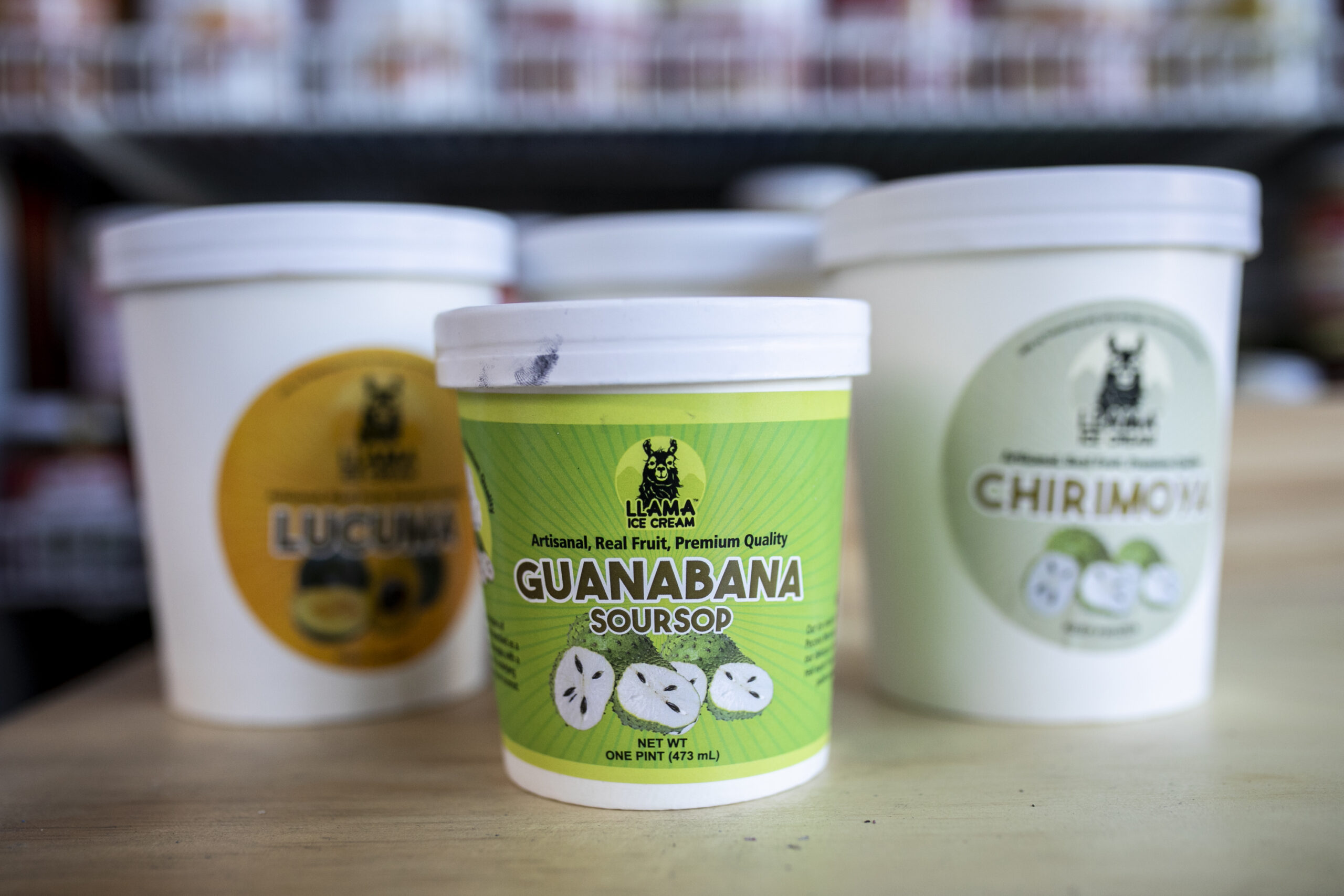
Photo Credit: Iaritza Menjívar
taste your way through a neighborhood's
Storied Markets
Travel the culinary world through exploring the immigrant-owned food shops at the heart of Somerville's beloved Union Square.

opportunity
The tour’s online presence has included a single, text-heavy HTML page, and a downloadable PDF – but neither is easy to use.
Additionally, since the tours began, gentrification has transformed Union Square. Upscale restaurants are thriving there, and residential real estate has skyrocketed. As demographic shifts in the area have priced some of the markets' clientele out of the city, the markets have also lost revenue. As recently as 2020, the treasured Guatemalan market, La Internacional, closed after more than three decades in operation.
How might we encourage local residents to help preserve Union Square's cultural diversity by supporting its global food markets?
approach
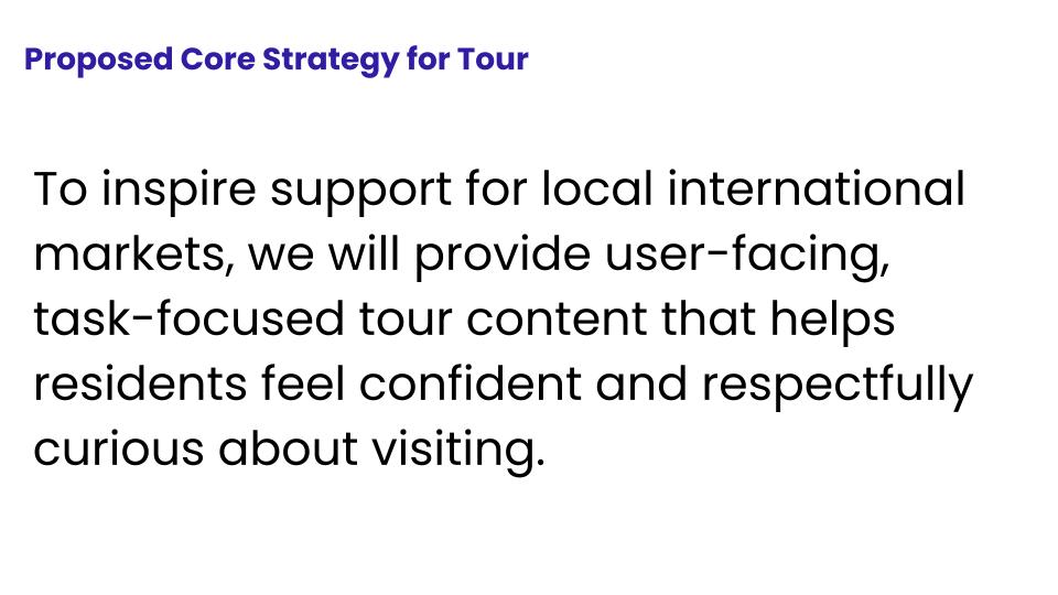
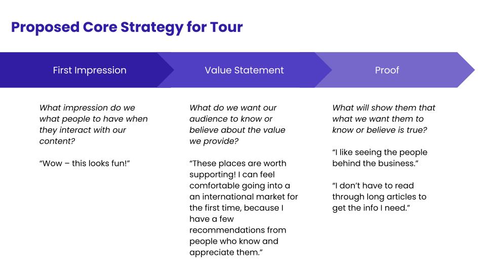
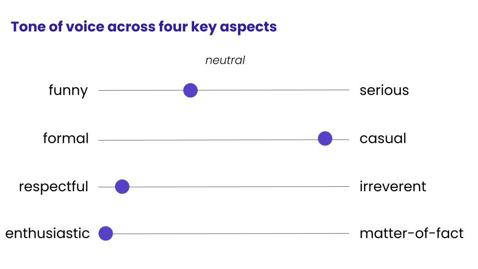
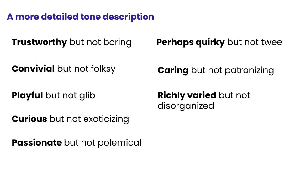
In redesigning the digital tours, we've sought to honor the in-person tours' spirit. Participants always enjoyed the tours' warmth, conviviality, and multi-sensory richness. Within a digital format, we've aimed to evoke these same qualities.
By energizing residents to explore at their own pace, we hope to generate more business for the markets. At the same time, we've emphasized the stores' resilience and uniqueness.
appreciate each market's
Unique Character
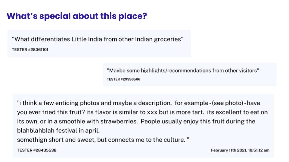
See what locals love about the business, at a glance.

meet
The People Behind the Business
With help from a community guide connected to the market's culture, meet the business' owners and understand the story behind their market.


get
Trusted Shopping Tips
Read up on the products people love most, from a guide connected to the cultures the market represents.
enjoy simple recipes for
Classic Dishes
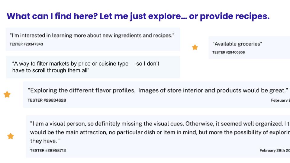
Learn how to actually prepare some easy snacks and meals at home, with ingredients from the market.
take the anxiety out of
Shopping Small
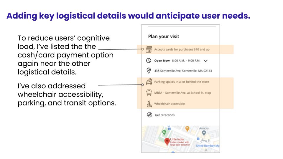
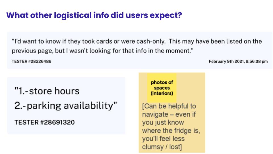
Quickly find accurate info on the market's payment options, transportation, and parking – logistical questions that might otherwise worry you when approaching a small business.
Discovery Process
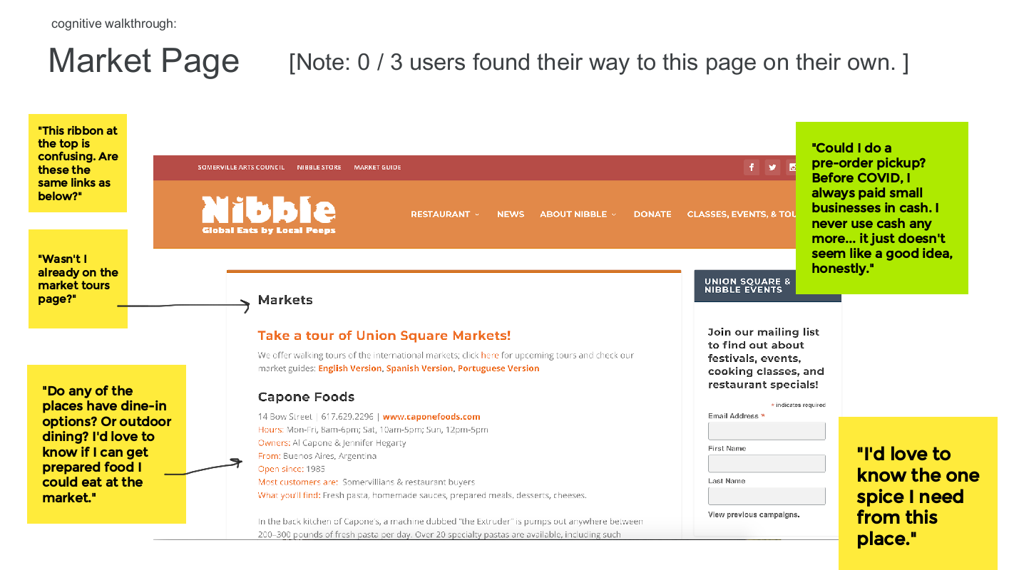
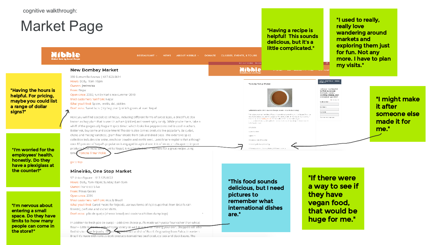
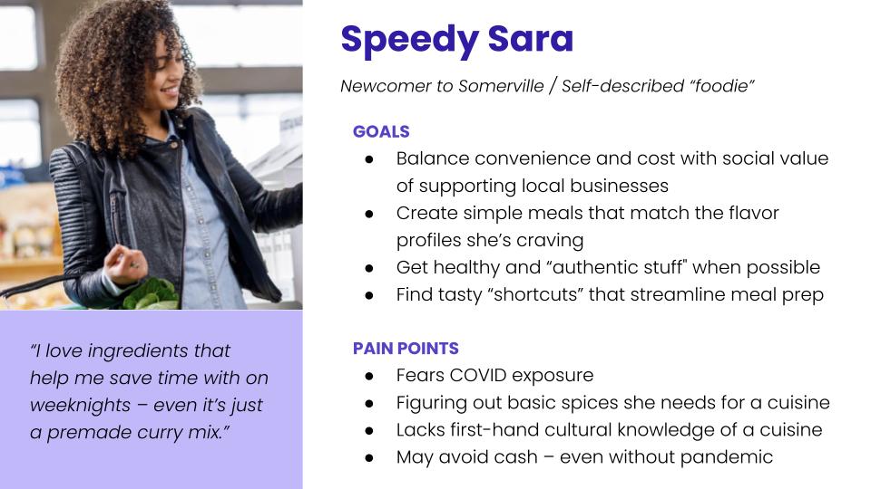
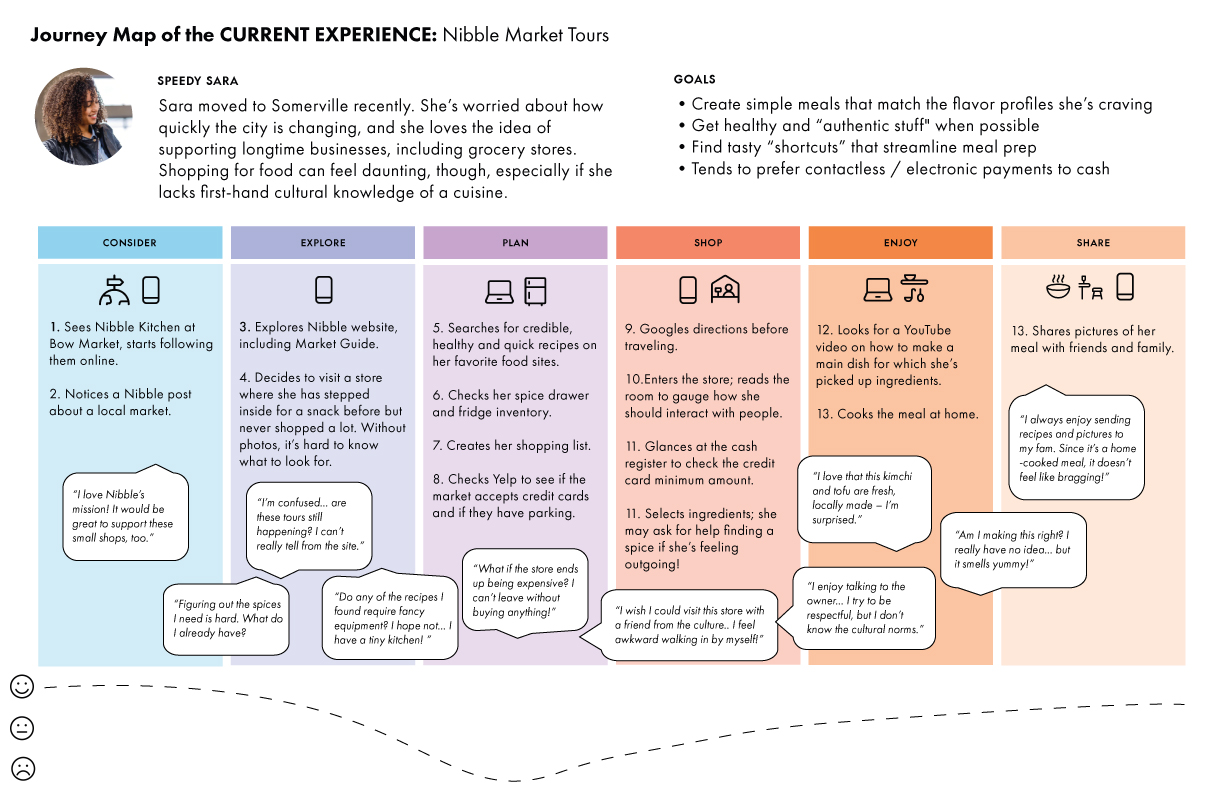
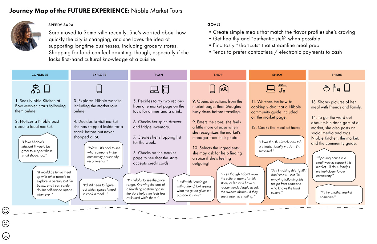
I launched the discovery process by interviewing Somerville Arts Council (SAC) staff, reaching out to market owners, and talking with culturally diverse website users. Additionally, I audited the site's information architecture, analytics, and accessibility. To delve deeper, I joined users for cognitive walkthroughs of the current site, listening to them think aloud as they navigated the content. Working with these data points, I worked with the SAC team to develop a persona and current-state journey map.
research methods

Information architecture analysis

Persona development

Site analytics

Journey mapping

Cognitive walkthroughs

Co-design workshops

User interviews
Rapid iterative testing & evaluation
key learnings
The community members' candor in our conversations both surprised and humbled me. In speaking with them, I learned:
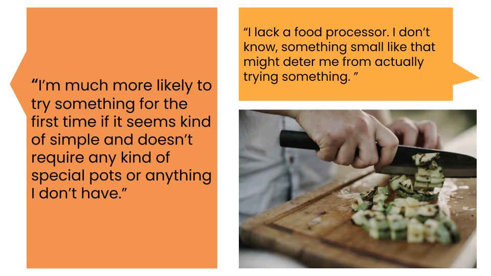
- They balance convenience, cost, and social values when shopping for groceries and cooking at home.
- Food can powerfully and pleasurably mediate connecting and learning across cultures.
- In cooking or enjoying food, they often seek to experience a specific "flavor profile," or combination of flavors.
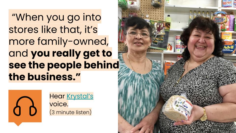
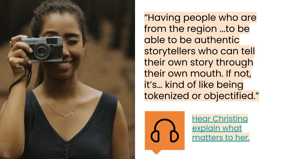
- They appreciate insights and guidance from people with a meaningful connection to the culture in which the food is rooted.
- Even if they grew up in an immigrant household, they may feel intimidated when entering a market.
- They may hesitate to enter small international shops due to their perceptions of higher prices, lack of culinary knowledge about a type of food, social anxiety (including a fear of awkwardly leaving without buying anything), and time constraints.
- None of the users were able to begin an online market tour, based on the page's current organization.
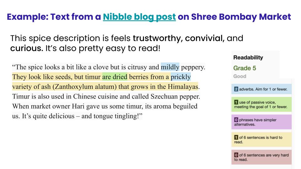
- The content's complexity and information architecture lessened users' engagement with it. Some of the writing had a postgraduate reading level, according to the Hemingway app. Additionally, the content was not organized for a user to easily scan, so users tended to skip over much of the information.
Design Process
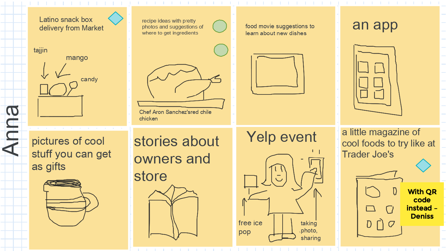
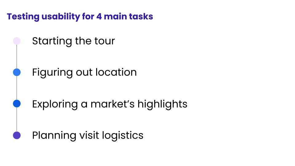
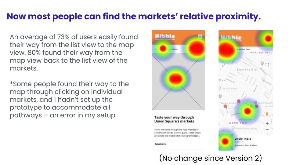
To envision a future online tour experience, I led the SAC team and community members in a virtual brainstorming exercise called Crazy Eights. Working from a new future-state journey map, I created wireframes, crafted a new content strategy, and recruited and trained volunteers to update the story of each market through a personal lens. Using InVision and Maze, I tested the second and third versions of wireframes with a total of twenty users. With each iteration, I incorporated changes based on users' behavior and feedback.
key learnings
The community taught us so much as we iterated through prototypes. In testing out wireframes, we gathered a few key takeaways:
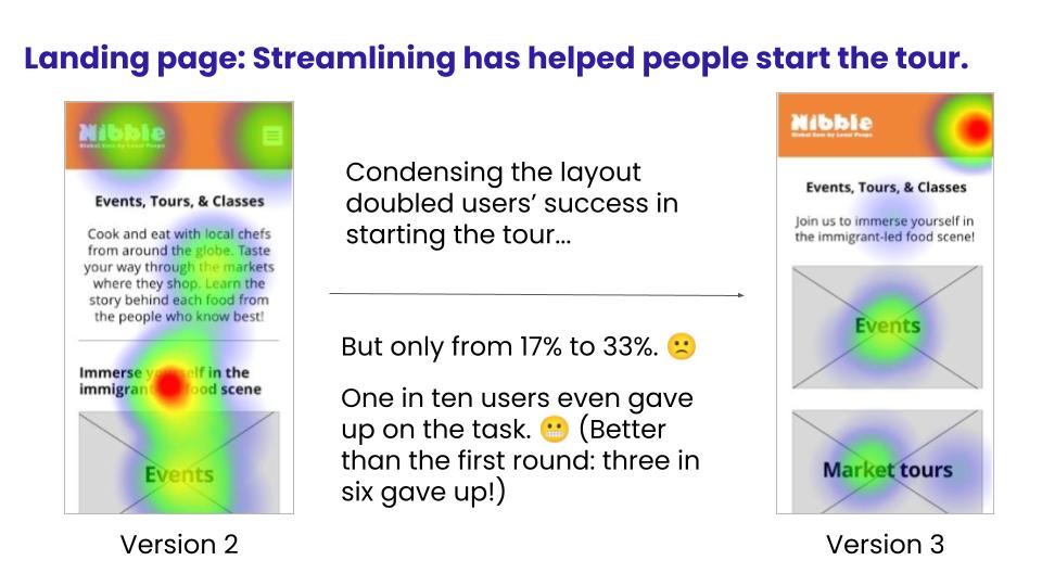
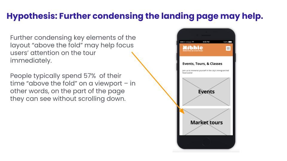
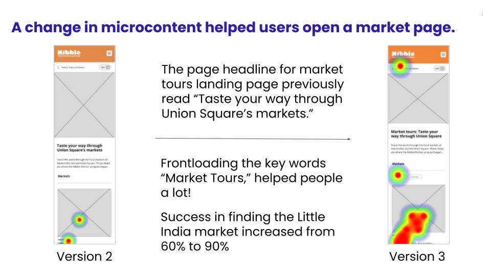
- Front-loading "market tour" in a header made it 50% easier for users to begin the tour! Tweaking this microcontent improved usability greatly.
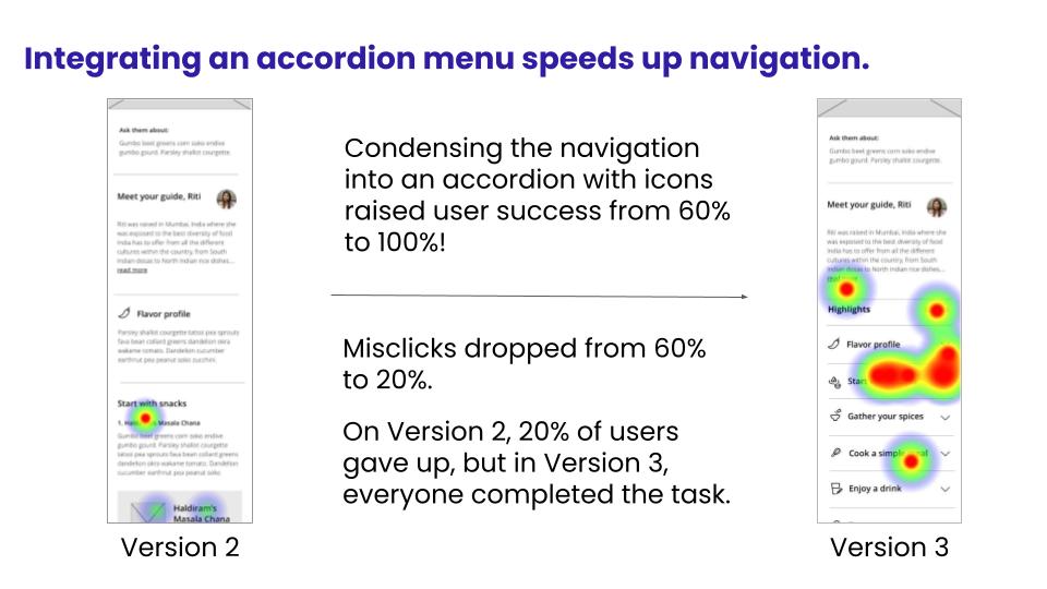
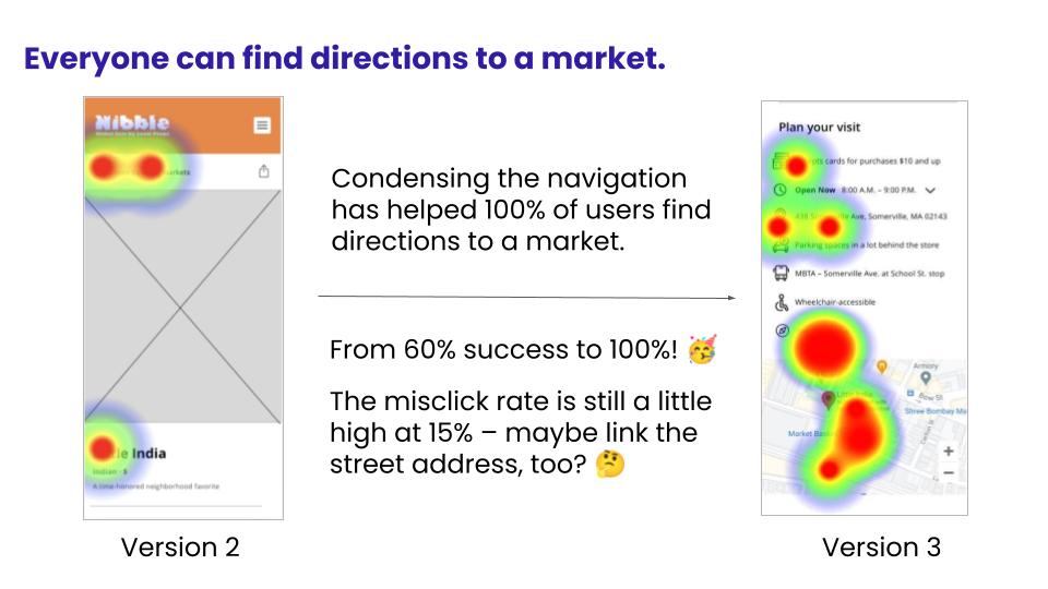
- The accordion menu made it 67% easier for users to find a snack recommendation and directions. With thoughtful topic headings, the layout reduced users' need to scroll, even with the complex content.
- Users sometimes appreciate seeing a key logistical detail given once and then repeated again at a relevant moment. For example, I list the stores' credit-card policy at the top of the page – in case it's a dealbreaker for people to even consider shopping – and again at the bottom, in response to user feedback.
- Building trust with users in my interviews with them helped me learn to speak their language. For example, several people I spoke with mentioned how they sought out a specific "flavor profile" – an unusual phrase for me personally, but one that excited them within the context of cooking and food.
- The new information architecture on the tour section's landing page made it 100% easier for users to begin a tour. Rather than burying the "Markets Page" link in a body text paragraph, I gave the market tour its own header and image tile, which helped users to easily start exploring the markets.
- Simplifying the content made it much more readable and goal-oriented. Using the Hemingway app, I helped bring the core content I edited from a postgraduate reading grade level from a postgraduate to fifth grade. I also trained the community guides and SAC team in readability principles as part of the content strategy I shared and developed based on our discovery process.
- Incorporating perspectives directly from people connected to the markets' cultures enriched the tour's storytelling. Their ideas and experiences gave the individual market guide pages a sense of immediacy, depth, and personal context.
summary
The redesign offers a fresh way to inspire residents to visit the markets. Accessible language, simplified information design, and colorful visuals encourage locals to explore them.
Contact
Interested in working with me? Get in touch!
hello@larkdesign.co
© Lark Design 2025
